CLIENT : QUET LOGO
EXPERTISES : 3D Design, Branding, Logo Design
L’ANNÉE : 2006
Project
Goals
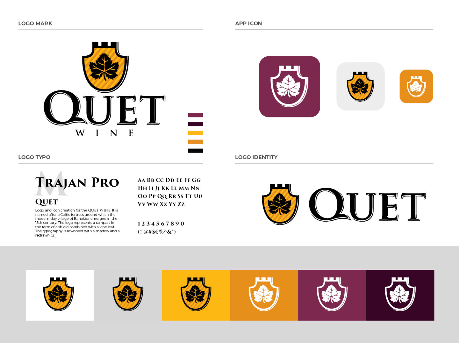
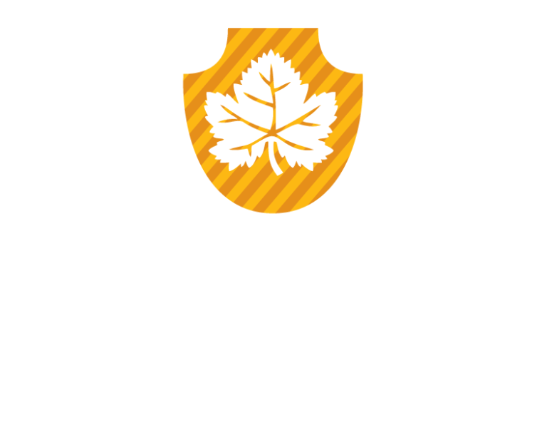
The logo represents a rampart in the form of a shield combined with a vine leaf. Yellow and orange lines represent coat of arms and give contrast. The typography is reworked with a shadow and a redrawn Q.

Brand
identity
Quet is the series of premium quality wines by Fruškogorski vinogradi. It is named after a Celtic fortress around which the modern-day village of Banoštor emerged in the 15th century. Quet wines are being produced since 2006 and have been pleasing the palate of wine lovers and connoisseurs ever since.
3D Design
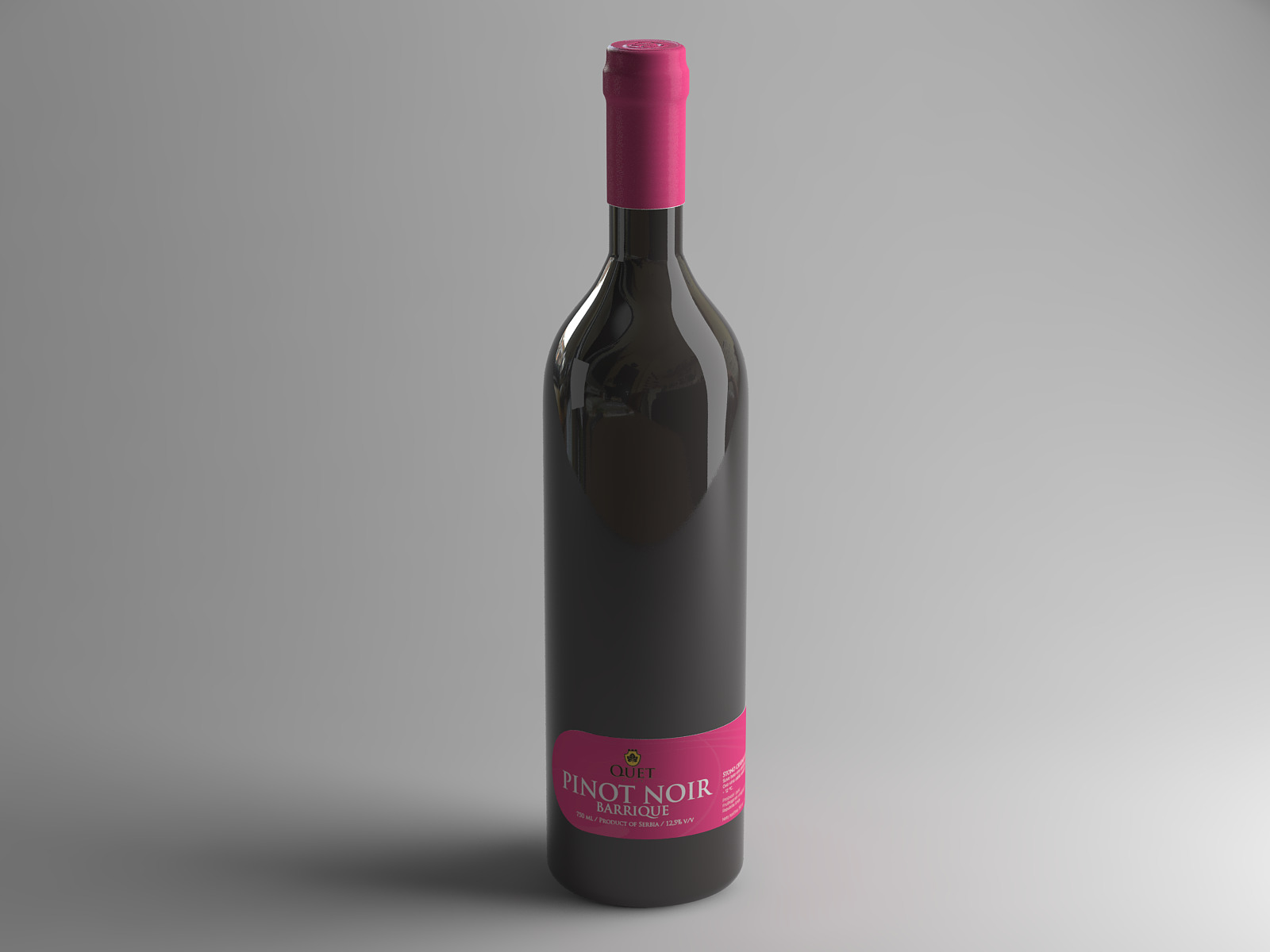
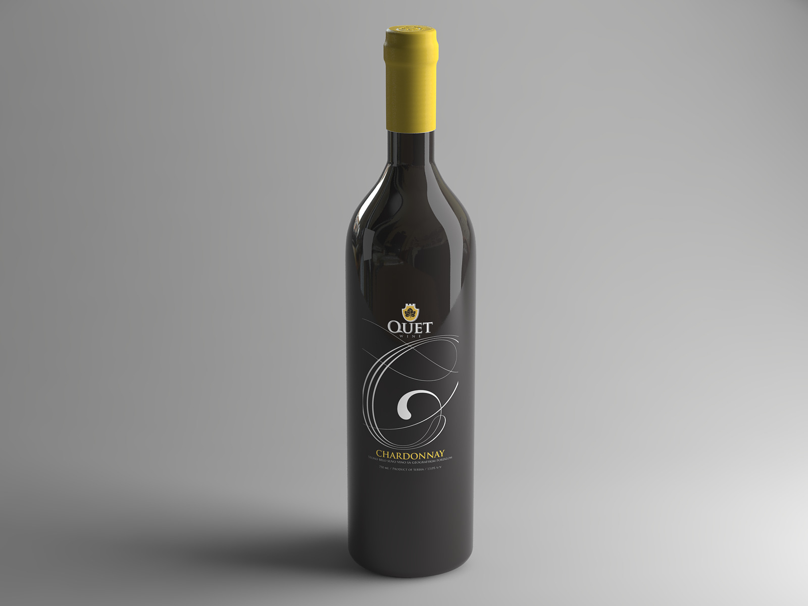
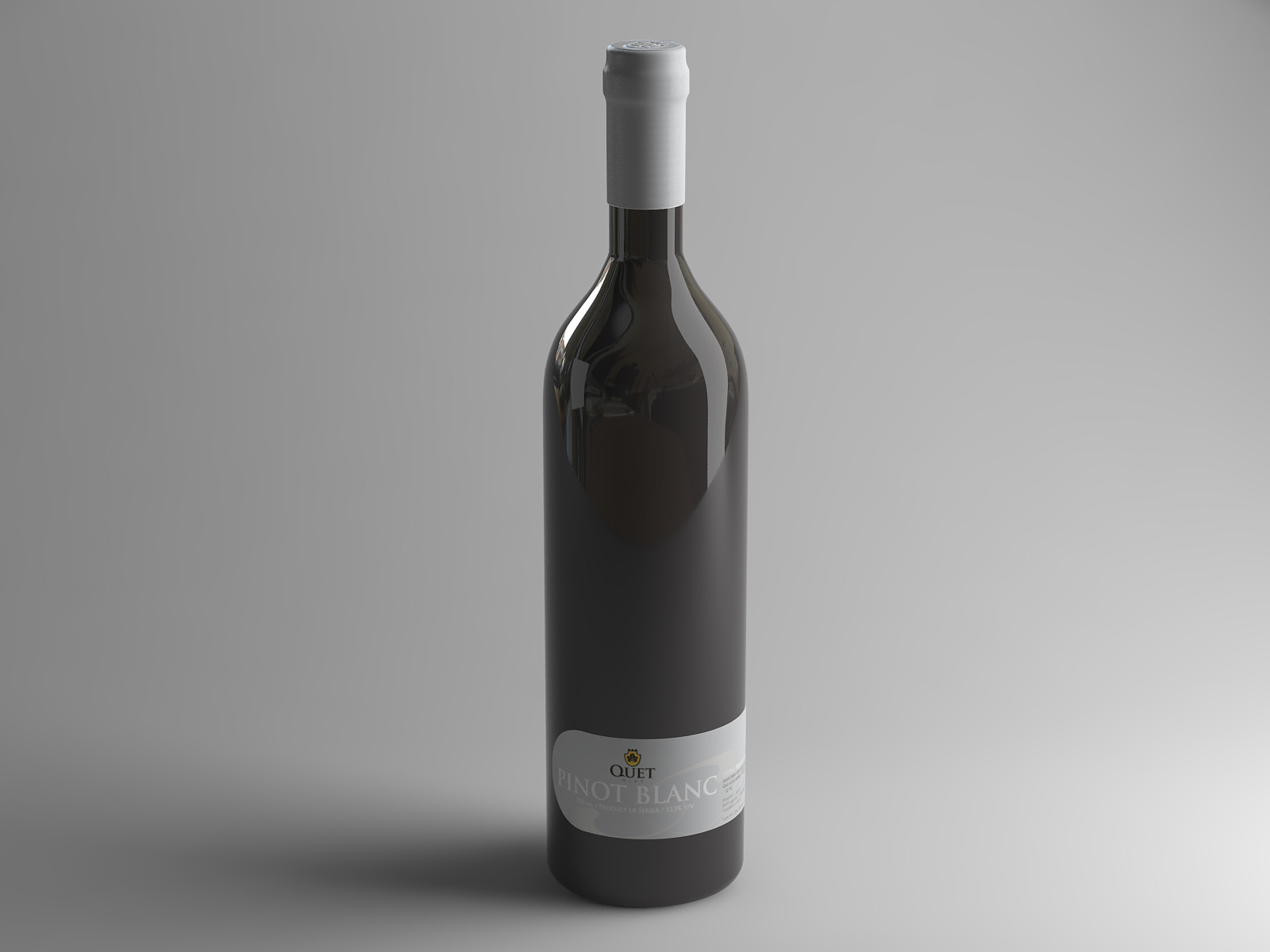
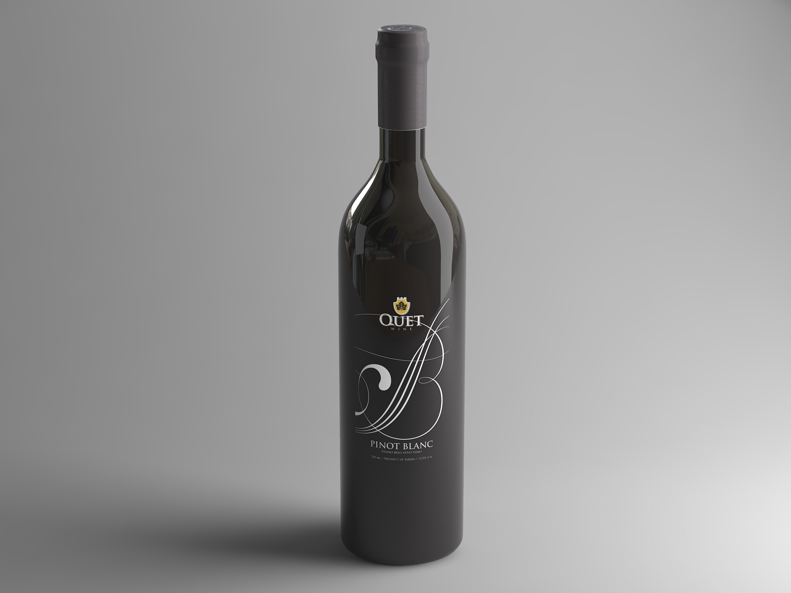
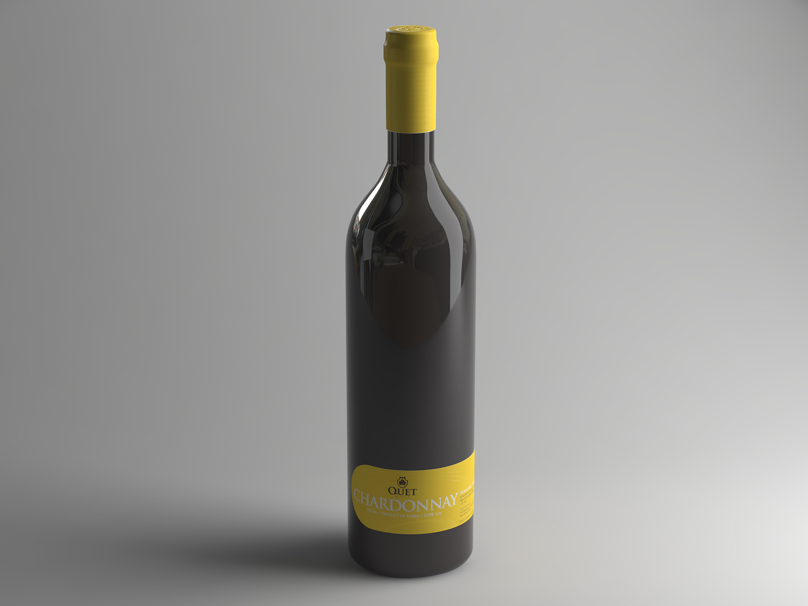
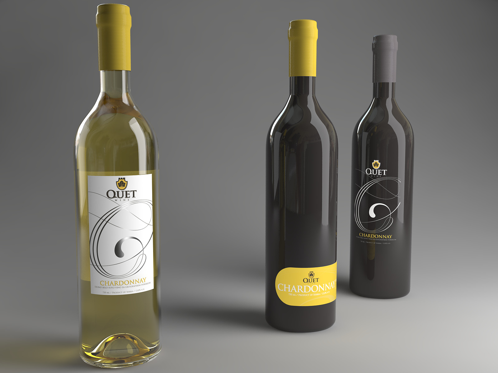
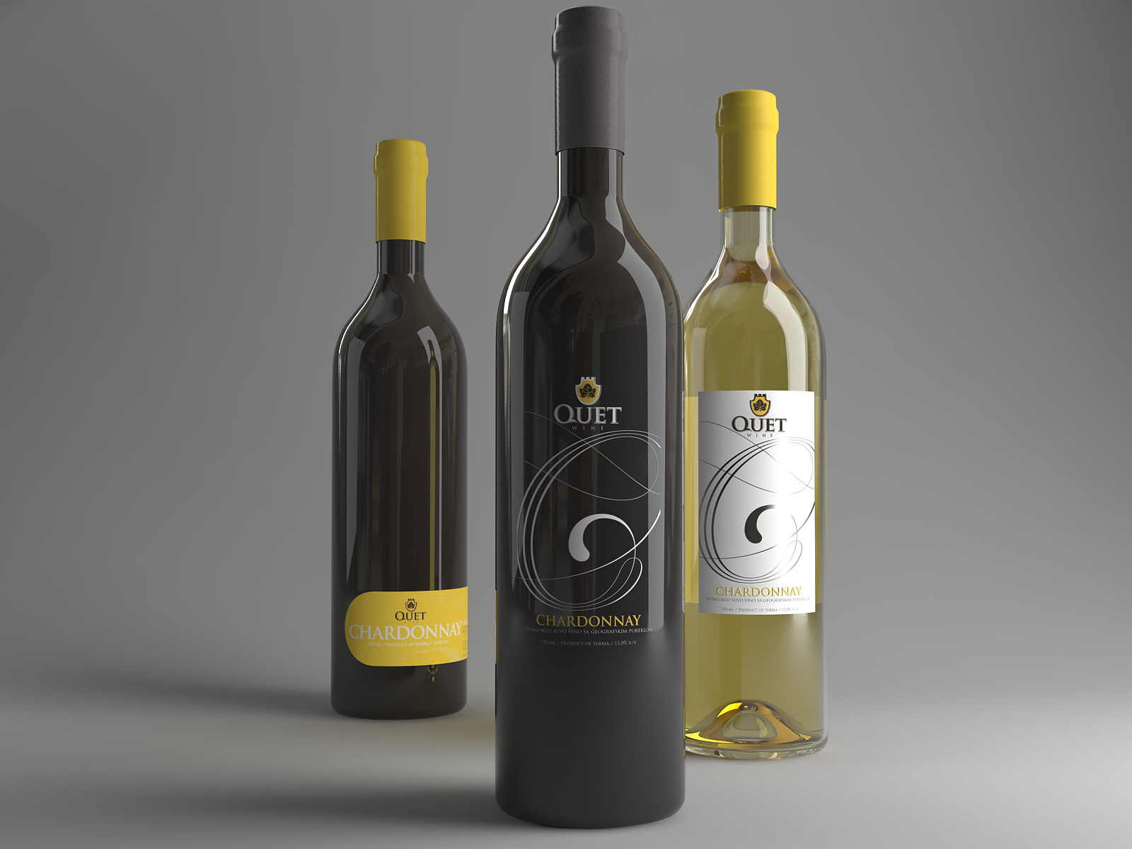
I created realistic 3D visuals to put in situation the logo and its declinaisons
Glass render
I played with more black glass renderings to have a less conventional chardonnay bottle style
VRAY ASSETS
I added a reflection map of an apartment interior
to give more realism
to give more realism
Quet Winery Branding
Services
Logo Design – Visual Design – Marketing Assets – 3D Design
Software used
Illustrator for logo design / InDesign for layout / After Effects for animated gif / 3dsmax and Vray for realistic 3D / Photoshop for visual adjustments


